Designing the website for Laboratório Vicente Lemos
Midnight blue with a blue accent, the Mais Saúde sub-brand, a searchable test catalog, a filterable locations page, the mobile layout, a cookie banner with a visible reject button and local presence: the design decisions behind a medical lab website.

Caio Gonçalves
· 7 min read
Laboratório Vicente Lemos is a clinical lab network in the Cariri region of Ceará and the backlands of Pernambuco, in northeastern Brazil. I built their entire website, from design to code, as a developer at Ponto Env, the company I work for. This post covers just one part of the work: the design. How the information was organized, why the colors are what they are, how the site behaves on a phone. Everything here can be checked by opening vicentelemos.com.
Who comes to a lab's website
Before thinking about color or type, it's worth asking what the person came to do. On a lab's website, it's almost always one of these:
- see a test result;
- find out whether the lab runs a test and how to prepare for it;
- find the nearest location and its opening hours;
- talk to someone.
Everything else (campaigns, the plan, history, certifications) matters, but comes after. The site's structure starts from that order.
The identity: midnight blue and electric blue
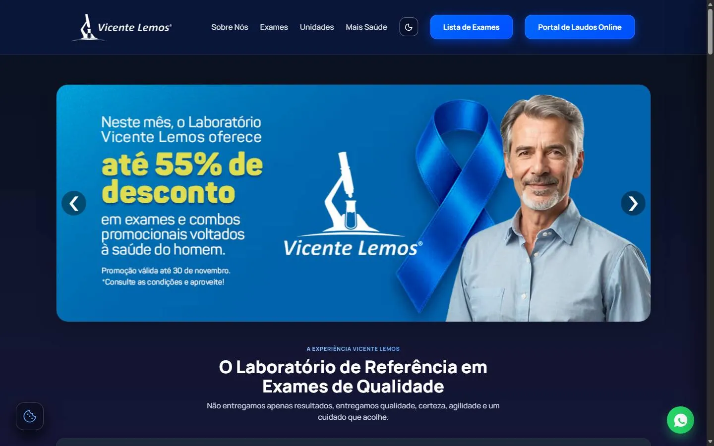
The default theme is dark, a midnight blue that's almost black. On top of it, the accent is a strong, saturated blue, used sparingly: the main buttons, the links, the details on the cards. The logo, which is white, stays legible without needing its own box or background.
The typeface is Manrope, a geometric sans-serif, with heavy headings and lighter body text. On the inner pages, large headings get a blue-to-violet gradient on one keyword, as in "Encontre qualquer código de exame" (Find any test code). Apart from that, the only effect is a soft glow around the main buttons.
There's a theme button in the header, with a sun and a moon, for those who prefer the light theme. Since it's icon-only, it carries a label for screen readers ("Alternar tema", toggle theme), as does the menu button on mobile.
The header: two buttons that matter
The menu has few items: Sobre Nós (About us), Exames (Tests), Unidades (Locations) and Mais Saúde. Next to them sit two filled blue buttons: Lista de Exames (Test list) and Portal de Laudos Online (Online results portal). Those are the two most common tasks of people arriving, so they aren't tucked away in the menu.
As you scroll, the header turns into a floating bar with rounded corners. It stays there, but takes up less room and makes it clear that it's navigation, not content.
The home page
Below the header comes a campaign carousel, with arrows on the sides. Campaigns change throughout the year, and the carousel lets the lab swap the artwork without touching the rest of the page.
After that, the page follows a simple order: what sets the lab apart, in cards with an icon and short text; the Mais Saúde plan; featured tests by area (hematology, biochemistry, hormones); frequently asked questions; locations; history and certifications.
The FAQ is an accordion. Each question is a line with a "+", and the answer opens in place. The questions are the ones asked at the front desk: whether fasting is needed, which documents to bring, the minimum age to come without a guardian, how to access results, whether it opens on Sundays. The list of accepted health insurance plans sits inside one of those answers, with each one's logo.
Mais Saúde: a sub-brand inside the site
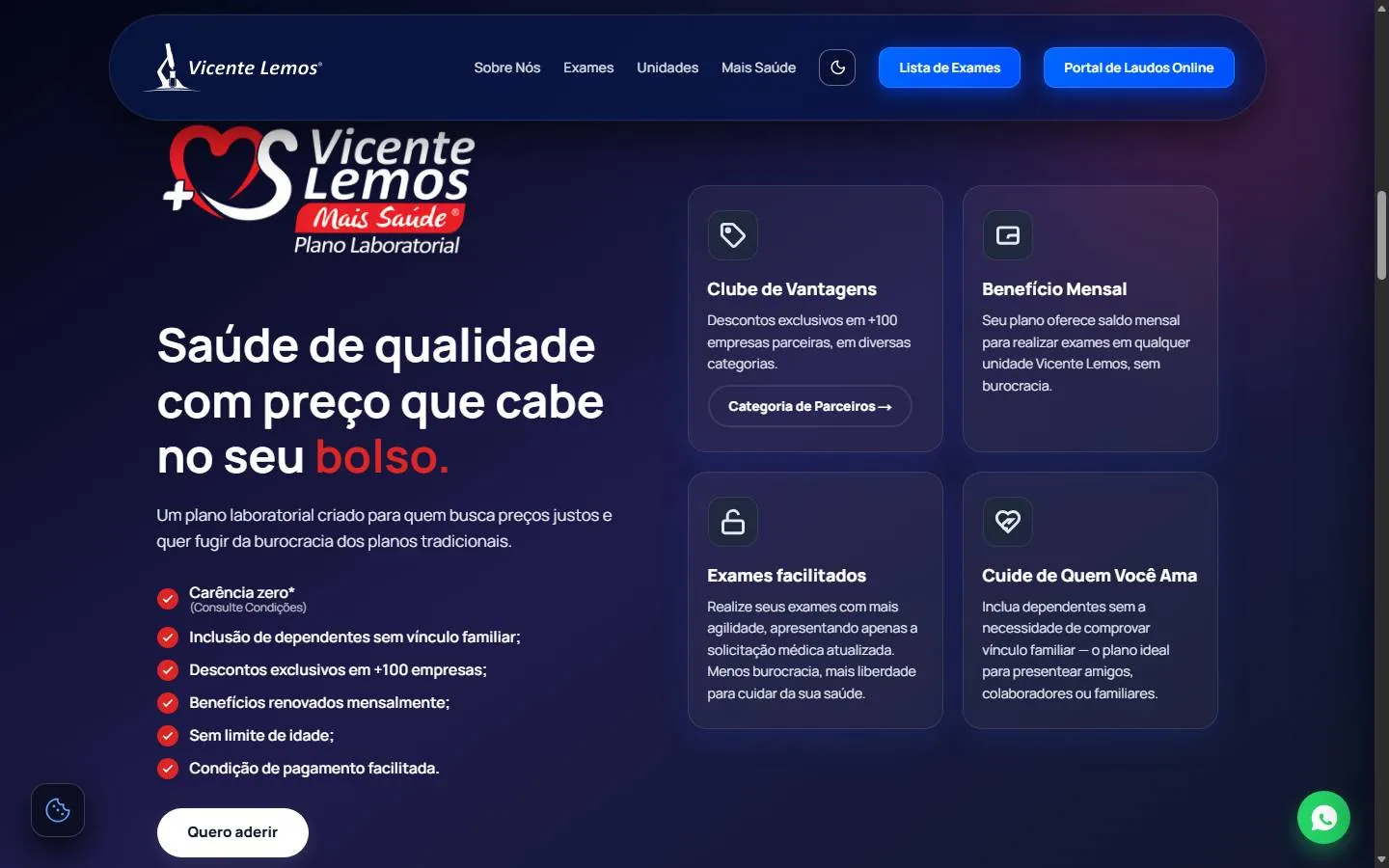
The Mais Saúde lab plan has its own identity, with a red logo. Instead of forcing the plan into the blue, the section uses its red, but only there: in the logo, in one word of the heading and in the check icons on the list of advantages. The rest of the section stays in the site's midnight blue.
That way the plan is recognizable without the red leaking into the rest of the page. The "Quero aderir" (Sign me up) button is white, to contrast with both colors, and opens a WhatsApp conversation.
The test catalog
The test list has its own page. Its center is a large search field that accepts name, abbreviation or code, and also several tests at once, separated by commas. That serves people who arrive with the doctor's order in hand and want to check everything in one go.
Above the search, a discreet box shows the call center's hours, for anyone who can't find what they're looking for. Below it, three numbers show the size of the catalog: how many tests are listed and how many have a code.
The locations
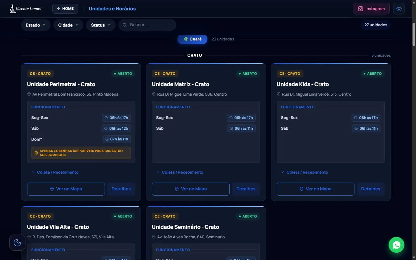
The locations page is where the design most needed to help with reading. There are 27 locations in 16 cities, across two states. The page handles it in layers:
- Filters at the top, by state, city and status, plus a free-text search and the total number of locations found.
- Grouping by state and, within it, by city, with a count for each group.
- Identical cards, with the same structure for every location: a tag with the state and city, the status ("aberto", open) in green, the name, the address and a table of hours by day.
Notices that apply to a single location, such as a cap on queue numbers on Sundays, appear in amber inside the card, next to the hours they refer to. The collection services are collapsed into an item that opens when the person wants it. At the end of each card, two buttons: "Ver no Mapa" (See on map) and "Detalhes" (Details).
On the phone
On mobile, the menu becomes a three-line button, the carousel spans the screen width and the cards become a single column. Two floating buttons stay within thumb's reach: WhatsApp on the right and cookie preferences on the left. They sit in the bottom corners, where they get in the way of reading as little as possible.
Privacy as part of the interface
On the first visit, a cookie banner takes up the bottom of the screen, with a direct heading ("Sua privacidade e segurança de dados", your privacy and data security), a paragraph explaining what the cookies are for and three buttons: Configurar (Configure), Rejeitar Tudo (Reject all) and Aceitar Todos (Accept all). Rejecting is a button the same size as the others, next to Configure, not a link hidden in the text. Once the person chooses, the banner goes away, but the choice isn't locked in: the button with the cookie icon, in the corner, reopens the preferences at any time. It's a small detail, and it's what makes the choice genuinely revocable.
Local presence
A regional lab is searched for by city name: "laboratório em Crato", "exame de sangue em Juazeiro do Norte". The site answers that with visible content, not just metadata. On the home page, there's a block listing the cities served in Ceará and Pernambuco, and a text that mentions each of them. Underneath, geolocation metadata points to the region.
Takeaways
- Start from the tasks of the people arriving. On a lab's website, results, tests, locations and contact come before anything else.
- An accent color used sparingly makes the right buttons stand out on their own.
- A sub-brand can have its own color, as long as it stays in its section.
- In long lists, like the locations, identical cards and visible filters are worth more than any decoration.
- Rejecting cookies has to be in plain sight, as a button, and the choice has to be reversible.
To see all of this working, the site is at vicentelemos.com. If you run a local business and want a website designed this way, get in touch.
- Design
- UX
- Accessibility
- Local SEO